
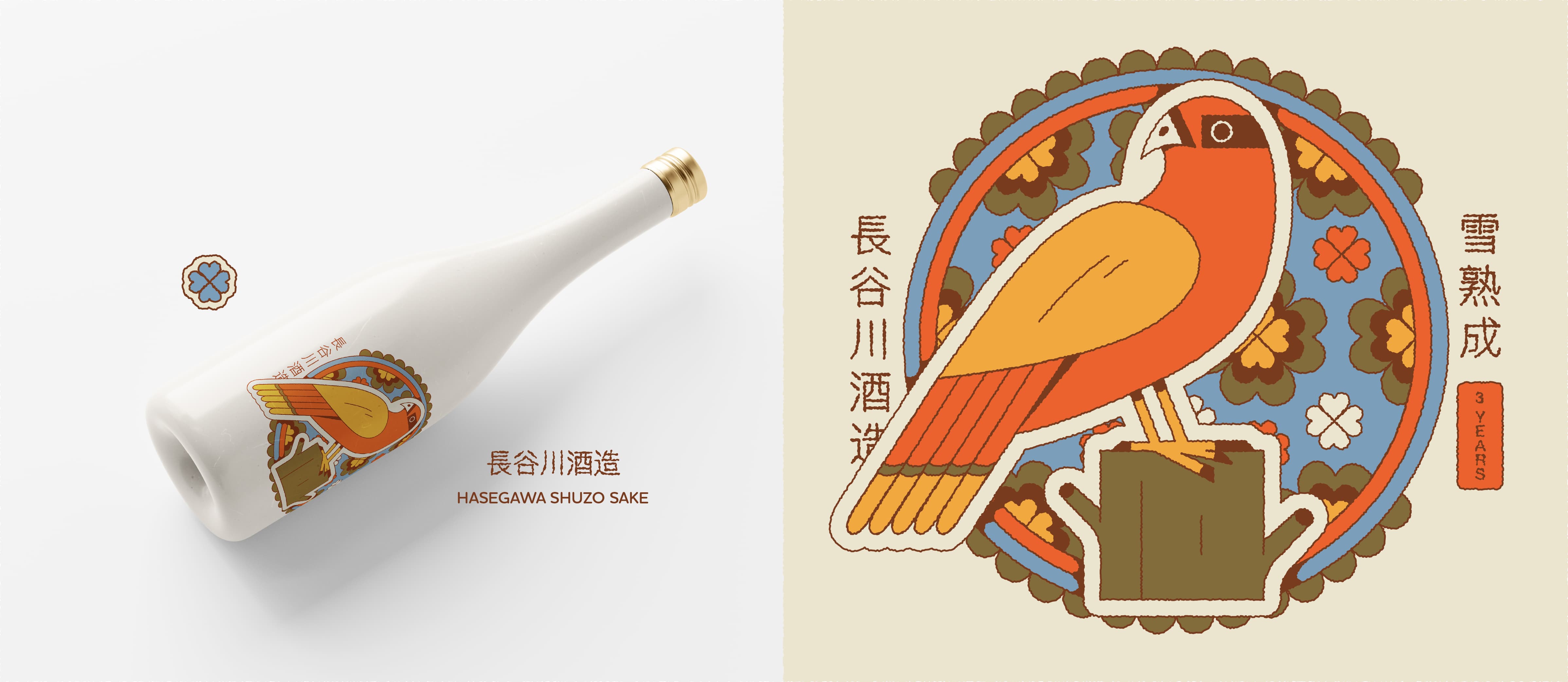
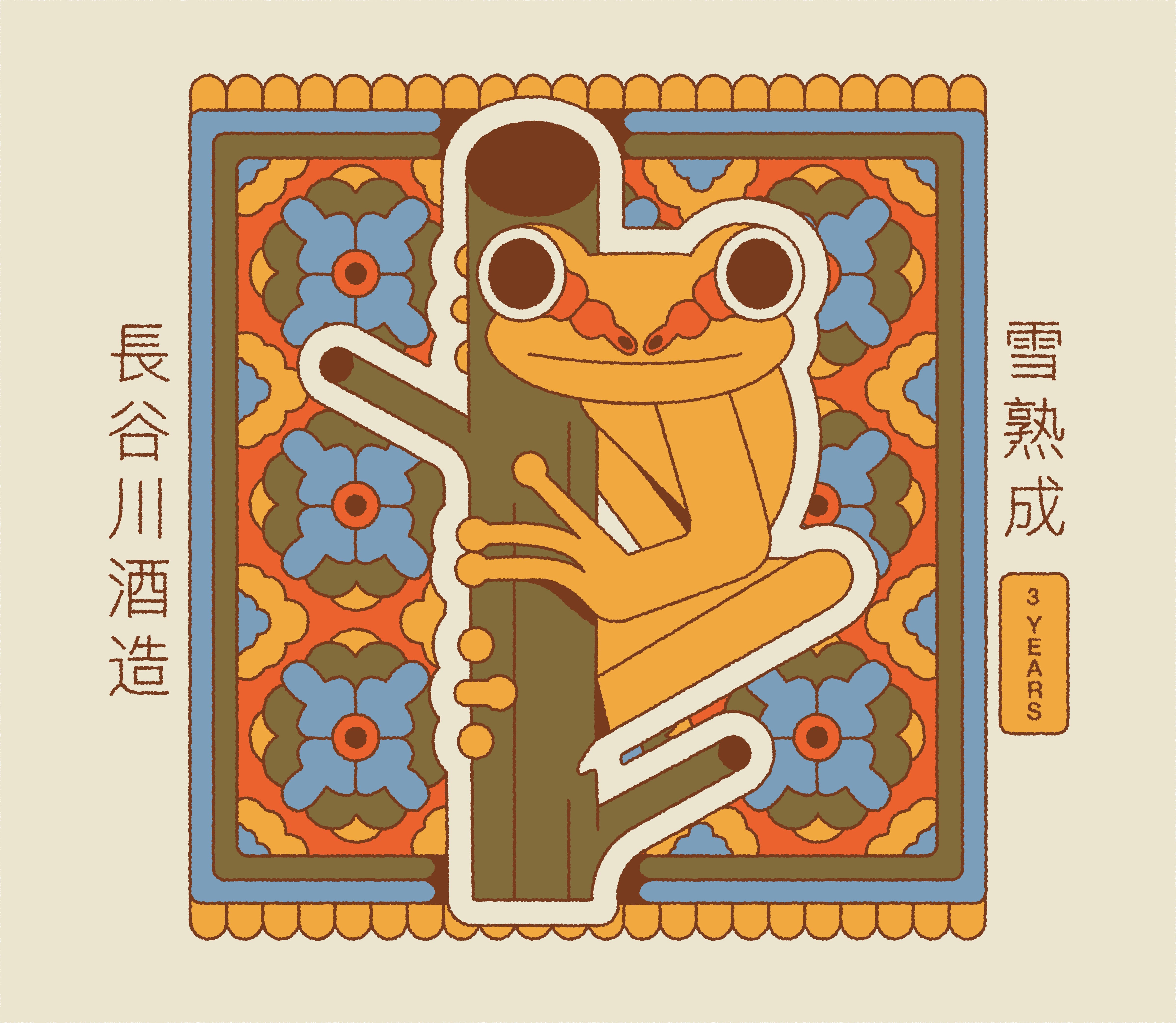
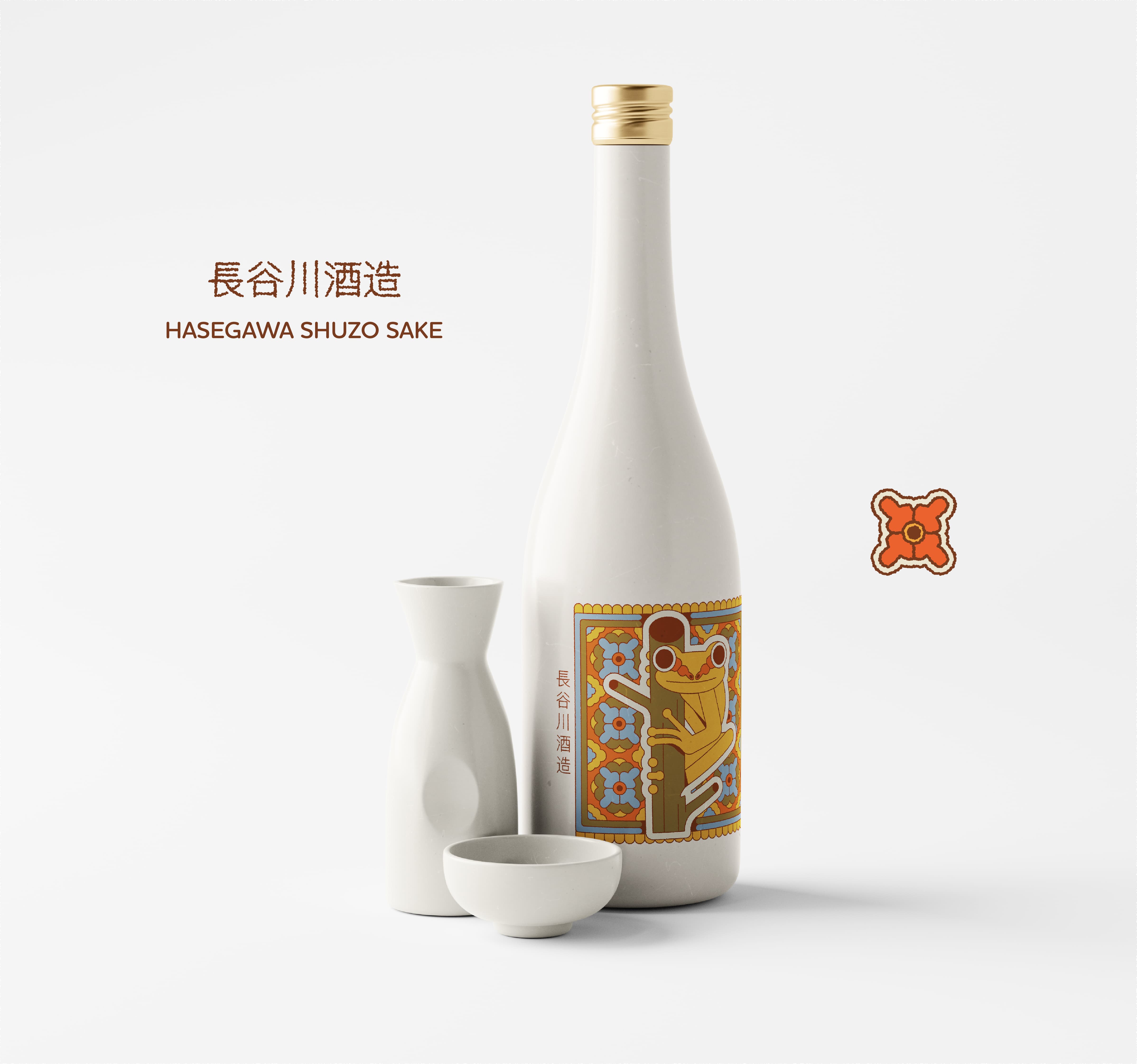
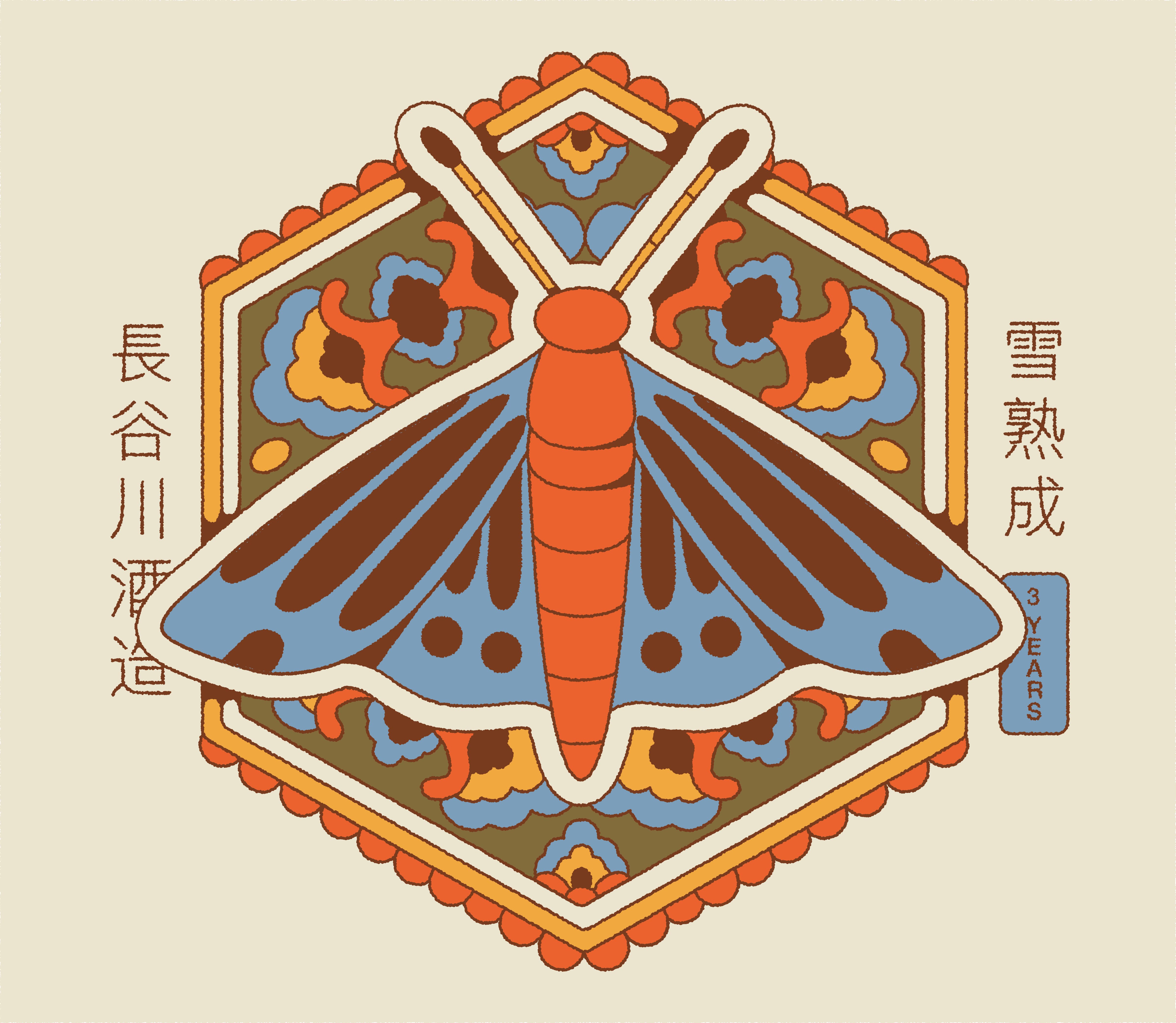
Hasegawa Shuzo Sake - Packaging
Niigata is one of Japan’s top spots for sake, and the city of Nagaoka really stands out. With cold winters, lots of snow, and fresh, soft water from nearby mountains, it’s got the perfect setup for brewing clean, smooth sake - especially the premium Daiginjo kind made in the chilliest months.
But it’s not just what’s inside the bottle that matters. Great packaging helps sake stand out, too. The right design - think color, fonts, and eco-friendly materials - can tell a story, show off a brand’s personality, and make people feel more connected to the product. As more folks care about sustainability, smart, stylish packaging can turn a simple bottle into something unforgettable.
Each project begins with a client brief, followed by creative research and concept development. I typically present a moodboard with 2–3 visual style options for the client to choose from. Once a direction is selected, I move into sketching - either full storyboards for animation or static sketches for illustration or branding work. When needed, I create a style test based on the chosen direction, focusing on a key frame.
After style and sketches are approved, and rounds of internal feedback (from the creative team) and external feedback (from the client) are addressed, after that - I vector the artwork. The vector phase usually includes up to three rounds of revisions. Final files are then either handed off to animation or delivered directly to the client for launch.

Credits
Illustration Lead: Deoné Rabé
Creative Director: Lené van Heerden
All the content was created while working at We Are Batch Tv